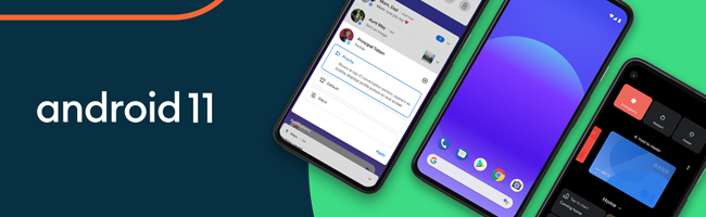
“It’s really important for us to acknowledge that Android is in fact, a large global brand,” said Sydney Thomashow, Google’s lead for brand and creative for Android. “In thinking about the brand, we wanted to make sure that we are as accessible and inclusive as possible.” Thomashow told this to me a couple of weeks ago at Google’s New York City office, where her team has been working on a completely new brand identity for Android. Android’s branding has maintained a fairly consistent look over the last decade, but as the operating system has grown from a few users to over 2 billion, Google has decided it needs to be more inclusive. As I noted above, green isn’t exactly an optimal color for a global brand. The most common form of colorblindness is red-green colorblindness, which can make certain shades of green hard to see. The best way to make green more visible is to mix it with colors that are easier to see, which is exactly what Thomashow’s team did. “[Android] started as a very, sort of limey yellow-green, then it got a little bit darker. And we knew that we wanted to continue to have green in our identity, and for it to be very prominent, but we thought about how might we start to introduce additional colors so that we could help with accessibility,” she said. “We took our existing Android green, and we actually added a little bit more blue into it. What that allowed us to do is start to complement the Android green with other shades of blue.” This move makes sense. Adding blue to Android’s existing shade of green allows the brand to match more closely with Google’s company branding, and gives more opportunity to mix the green with other colors. Thomashow’s team developed a palette of new brand colors to go along with the new Android green, for things like visual assets and packaging. While rethinking how it could make Android’s branding more accessible, Google concluded tasty treat version names don’t work well in a global market. In some regions, people have never heard of KitKat bars. And let’s be real, does anyone really know how to pronounce nougat? While it’s a little sad to hear, moving away from version names to version numbers was the best call. Now, Android Q is officially Android 10. This is a bit sad for the community, which has always loved to guess what the next version will be called. But Google assured me that it will still use internal codenames for major Android releases. Android Q was a bit of a transition period, likely because not many recognizable treats start with the letter “Q.” Regardless, I’d love to know what Google decides to call Android 11 internally. But even with version numbers, Google is maintaining cohesiveness in the wordmark. The new design for Android 10 has the same curve you’ll find in the Android wordmark, referencing the robot. It all feels very similar and should help Android’s brand be much more accessible. “So you’ll even notice in the mark for Android 10, that the same radius that you’ll see reflected in the Android wordmark has been carried through into the number 10. So that number “1” that you see has that same little curve, that same radius, which of course is based on the shapes that you see in the Android robot,” said Thomashow. “In many ways, the Android robot has made its mark in many more aspects of our brand identity.” It’s nice to see Google embracing Android as part of the Google brand. I personally thought it would eventually shift the branding to something along the lines of Google OS. That’s still possible, but Google seems to be leaning into Android for now. The dessert naming scheme might be disappearing from products, but the core OS is still the same Android we’ve always loved.


EDUPLUS TECHNOLOGY FOR EDUCATION
January 15,2021
COVID-19 LETTER ON THE BEHALF OF THE TEAM
January 15,2021
INSIDE GOOGLE’S MASSIVE ANDROID REBRANDING
January 09,2021